Well, #TC16 is officially over. As the saying in Texas goes, I did my part to Keep Austin Weird (but more on that later).
A crew of Simantelites from both strategy and creative descended on Austin for the ultimate mashup of data, insights and visualization. As data and marketing continue to evolve together, this conference is growing to truly offer something for everyone.
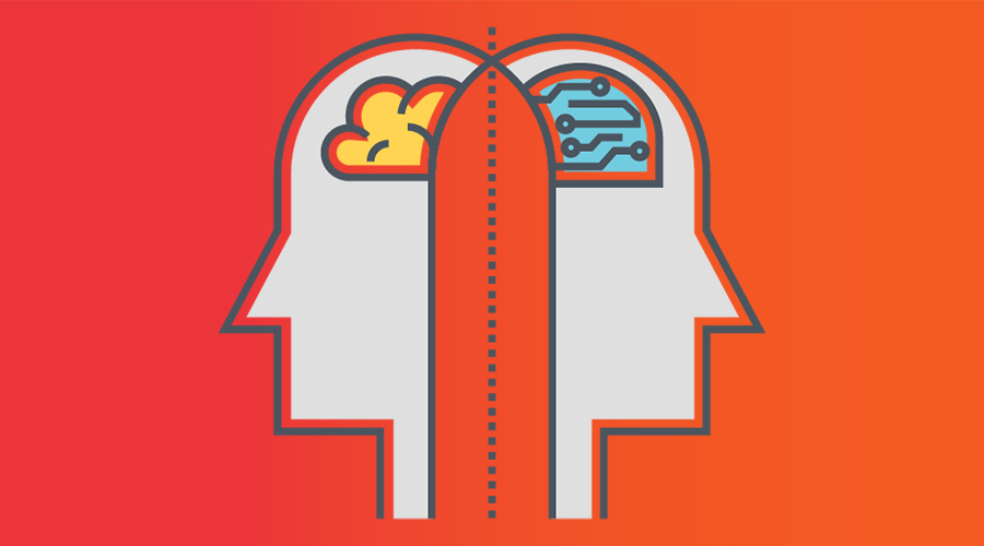
What is Tableau?
Tableau is our data visualization tool here at Simantel. The versatile Tableau platform combines ease of use (enabling the whole organization to view and interact with relevant data) with all the statistical capability and data power any analyst could ever need. It allows us to process and analyze complex data and tell meaningful stories through visualizations. It truly is the balance of art and science.
Why It Matters
The key takeaway from the conference was clear: Data visualization allows a story to be told. Without it, data doesn’t mean much. The stories we tell help marketers make important decisions, like justifying additional marketing budgets, making optimizations to campaigns and getting all stakeholders on the same page.
For deeper insights on harnessing the power of data, check out our recent article, Getting Real About Data.
Illustrating Weird with Data
Some crazy things happened while we were in Austin. Let’s use data to visualize what all took place.
Weird Event #1: America Elects a New President
During my first-ever trip to both Austin and a Tableau Conference, an extraordinary thing from a data perspective happened: A new president of the United States was elected. And considering Austin was blue dot in a red state, my current geography brought on a unique perspective.
Regardless of whom you supported, I think it’s safe to say we have all seen (and are still seeing) visualizations of the country and understand the meaning of these red and blue maps.

The two maps illustrate the Electoral votes that are more than a century apart. The one on the left is from 1908 and the one on the right is from 2016.
What I find noteworthy in the visuals:
- The shift in which party states supported is easily seen because the colors stand out
- The Southeast went from solid blue to solid red
- The majority of the Northeast went the opposite direction
- The number of electoral votes by state is not as easily seen because you have to actually look at the numbers displayed
- Texas jumped from 18 in 1908 to 38 in 2016
- California exploded from 10 up to 55
The use of visualization the most recent election was unparalleled. Even up to election night, we were seeing live maps and predictions using data. The New York Times dedicated its whole election section to mostly visualizations. Why? Because they are quick, easily understood and communicate clearly in a way words cannot.
Weird (WONDERFUL) Event #2: Cubs Win the World Series
So why did I use 1908 as the benchmark in the electoral example? If you’re a Cubs fan, you know why. Throughout the week I was proudly sporting red and blue for another reason.
Something else weird happened right before my week in Austin: My beloved Cubbies overcame a 3-1 deficit to clinch the World Series. It was only the sixth time that a team recovered from three games down to win in the 112 editions of the Fall Classic. And in case you have been living under a rock for the last decade century, the win was the Cubs’ first championship in 108 yers.
(Sidenote: I also tried to look up the price of gasoline to add one of those witty then-and-now comparisons here, but gas really wasn’t a big thing back in 1908. Here’s a visualization of gas prices over time to give you an idea.)

Weird Event #3: Partying with Snoop Dogg
This may be the last thing that you would expect in an article written by a data expert. But that’s just what we did at a conference after-party.
And what would be the chances of a Cubs fan from Illinois running into the World Series-winning pitcher while visiting Austin, too? Below is me with Cubs pitcher John Lackey, while Snoop Dogg performed on stage.
That’s a sentence I never expected to write in a blog. I am flying the W flag for my Cubs, but it was decidedly a West Coast kind of night. Can’t get much weirder than that.

What We Can Learn
These visualizations are just the start. The complexity of data continues to increase, and the possibilities for visualization are endless. Contact us to chat about how we can help put your data to better use.
As I sit here reflecting on the awesome week I had in Austin — amid a once-in-a-century Cubs win, the most shocking and dissected election in my lifetime, and an unexpected Snoop Dogg performance — I feel the experience can really only be accurately described as “weird.”
To borrow a phrase from the late, great Harry Caray, “just wait ’til next year!”