We began working with G&D Integrated on their new identity in 2004. At the time G&D—a regional logistics provider—had evolved into three distinctly branded business units: G&D Transportation, CDO Distribution, and SPS Warehousing. The challenge G&D faced was extreme overlap of customer interaction, which drove inefficiencies, caused widespread customer confusion and weakened its brand.
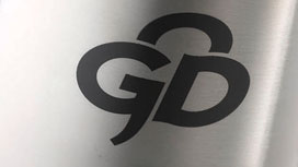
Using our strategic approach (Brand Discovery), insights indicated the G&D Transportation name had considerable equity, as did the shamrock mark used in the logo. “G&D Integrated” was recommended as the best naming solution to bring the businesses together under a new, “Smart. Efficient. Logistics.” brand position. Along with the new name, we also recommended logo refinements that would leverage the equity in the shamrock. All graphics developed in the exploration-phase emphasized rapid movement to reinforce the strength of the company’s combined resources to efficiently meet customers’ logistics challenges.
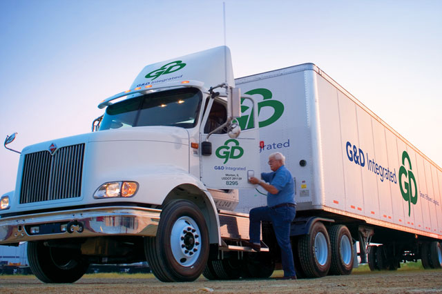
The final mark enabled the client to really “own” the identity because the shamrock is uniquely G&D. To accompany the new identity of G&D Integrated, we developed brand guidelines and creative tactics, such as branded products, business collateral, website updates, truck signage, a capabilities brochure and more.
LOGO

STATIONARY SYSTEM

SIGN

BRANDED PRODUCTS

TRUCK GRAPHICS