Imagine combining forces with your biggest competitor… That’s the situation that two competitors—Busey Bank and Main Street Bank—faced when both companies planned to merge.
Internally, there were significant differences in their corporate cultures that required assimilation. Externally, their individual strengths needed to be leveraged under the Busey Bank name.
Simantel’s Approach
Our research indicated equity and positive feelings associated with both logos, most notably the graphic image of the pillar within the Main Street logo. Knowing the Busey Bank name had been selected for use after the merger, it made sense to explore using a component of the Main Street Bank identity, such as the pillar.
Also, in development of the new brand identity, we set out to achieve the following goals: 1) present the idea of continuity between the two brands after the merger’s completion, and 2) increase buy-in from employees.
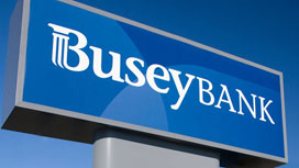
After testing the logo with Busey Bank’s key stakeholders and customers, we arrived at the logo (shown below). To accompany the new identity, we developed creative for website updates, a brand standard and guidelines booklet, direct mail campaign, brochures, business collateral, television spots, outdoor advertising and more.
LOGO FAMILY

STATIONARY SYSTEM


SIGN

BROCHURES


